List Items
Most applications need to display a list of items of one kind or another. Sometimes the items in the list are very simple, like the name of a contact, while other times they are complex, like a drawer containing prompts and buttons.
The Enyo framework and Moonstone library offer a healthy selection of tools for building lists in your applications. In this document, we survey the set of kinds specifically designed for use as list items, along with some others that are normally used in conjunction with lists. (The kinds for the lists themselves are covered in the separate documentation for Lists.)
List Item Kinds
Each item in a list may contain a text string, an image, or both. The Moonstone library offers kinds that implement these basic types of list items, as well as some with more advanced features. (Note that these kinds may also be used in other contexts besides lists; e.g., in menus.)
moonstone/Item
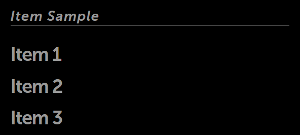
moonstone/Item, the simplest list item kind, provides an item with a text label specified in its content property.
    var
        kind = require('enyo/kind'),
        Divider = require('moonstone/Divider'),
        Item = require('moonstone/Item');

    components: [
        {kind: Divider, content: 'Item Sample'},
        {
            components: [
                {kind: Item, content: 'Item 1'},
                {kind: Item, content: 'Item 2'},
                {kind: Item, content: 'Item 3'}
            ]
        }
    ]
moonstone/Item
moonstone/LabeledTextItem
moonstone/LabeledTextItem extends moonstone/Item, adding the label property, which serves as a label accompanying the content specified in the text property.
    var
        kind = require('enyo/kind'),
        LabeledTextItem = require('moonstone/LabeledTextItem'),
        Scroller = require('moonstone/Scroller');

    components: [
        {kind: Scroller, classes: 'enyo-fill', components: [
            {
                kind: LabeledTextItem,
                label: 'South Park',
                text: 'Follows the misadventures of four irreverent grade schoolers'
                    + ' '
                    + 'in the quiet, dysfunctional town of South Park, Colorado.'
            }
        ]}
    ]
moonstone/LabeledTextItem
Note that the label and text fields in this example are not focusable in Spotlight.
moonstone/ImageItem
moonstone/ImageItem combines an enyo/Image with a moonstone/LabeledTextItem. By default, the image is positioned on the left side of the text.
    var
        kind = require('enyo/kind'),
        ImageItem = require('moonstone/ImageItem');

    components: [
        {
            kind: ImageItem,
            source: './assets/south_park.png',
            label: 'South Park',
            text: 'Follows the misadventures of four irreverent grade schoolers'
                + ' '
                + 'in the quiet, dysfunctional town of South Park, Colorado.'
        }
    ]
moonstone/ImageItem
To position the image on the right, set imageAlignRight: true.
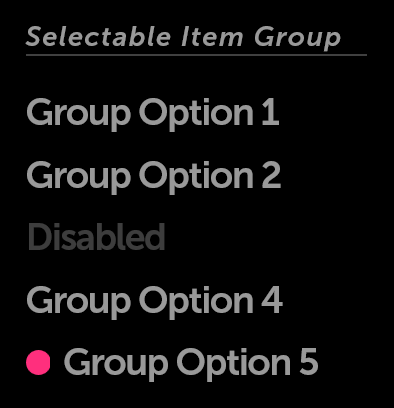
moonstone/SelectableItem
moonstone/SelectableItem features the selected property, which contains a boolean value indicating whether the item is currently selected. A selected item will be displayed with a pink dot to its left.
moonstone/SelectableItem also supports the Enyo Group API by exposing the active property (a boolean indicating whether the item is the currently selected item within the group) and the onActivated event (fired when the item is tapped). By default, when items are placed in a group, only one may be active at a given time; if a new item is activated, the previously active item (if there is one) is deactivated.
    var
        kind = require('enyo/kind'),
        Divider = require('moonstone/Divider'),
        Group = require('enyo/Group'),
        SelectableItem = require('moonstone/SelectableItem');

    components: [
        {kind: Divider, content: 'Selectable Item Group'},
        {kind: Group, onActivate: 'groupChanged', components: [
            {kind: SelectableItem, content: 'Group Option 1'},
            {kind: SelectableItem, content: 'Group Option 2'},
            {kind: SelectableItem, disabled: true, content: 'Disabled'},
            {kind: SelectableItem, content: 'Group Option 4'},
            {kind: SelectableItem, content: 'Group Option 5', selected: true}
        ]}
    ]
Selectable Items
moonstone/ExpandableListItem
moonstone/ExpandableListItem is a control with an expanded state and a collapsed state. It displays a header while also allowing additional content to be stored in an enyo/Drawer; when the header is selected, the drawer opens below. The drawer is closed by tapping on the header text or navigating (via 5-way) back to the top of the drawer.
While an ExpandableListItem's child components may be of any kind, by default, they are instances of moonstone/Item.
In additional to being useful within lists, moonstone/ExpandableListItem serves as the superkind for a variety of Moonstone pickers. For more information, see the documentation on Pickers.
Other Kinds Used with Lists
moonstone/Divider
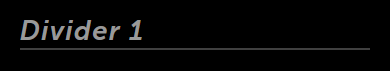
moonstone/Divider is a non-actionable separator control that consists of a horizontal rule and a text label. The text label supports marquee behavior for long content.
Dividers are commonly used as category headers (e.g., "A", "B", "C", etc.) within a list.
    var
        kind = require('enyo/kind'),
        Divider = require('moonstone/Divider');

    components: [
        {kind: Divider, content: 'Divider 1'}
    ]
moonstone/Divider
moonstone/ListActions
moonstone/ListActions is a menu of actions that resides on the right side of a list. When the activator control is pressed, the menu opens to reveal a set of actions that may be performed on the items in the list to its left.
The ListActions menu may contain options for sorting (alphabetically, by date, etc.) or filtering (show only games, show only free items, etc.). It may also contain options for editing (deleting or moving) list items.