Resolution Independence
Enyo and Moonstone are now resolution-independent, which means that a single app can support multiple screen resolutions, including HD (720p), FHD (1080p) and UHD (4k).
TV apps are still developed using FHD-based pixel measurements in CSS and JavaScript, but the framework will convert these FHD-specific measurements into resolution-independent units so that your app will scale to the proper size, regardless of whether it is running at HD, FHD or UHD resolution.
What a multi-resolution app looks like
Your app should look the same, whether it's running at HD, FHD, or UHD!
There will be more pixels at higher resolutions, of course, but the elements on screen should appear to have the same physical size at any resolution. For example, if a button is 1-inch wide on an HD resolution screen, it should also be 1-inch wide on an FHD (or UHD) screen having the same physical dimensions.
The easiest way to see this in action is to open a Moonstone sample, such as the Activity Panels sample, and use the device emulation feature in the Chrome Web Inspector to switch between HD and FHD resolutions. (Depending on which sample you're looking at, you may need to reload the page after changing resolutions, since any JavaScript-based layout won't automatically be re-run otherwise.)
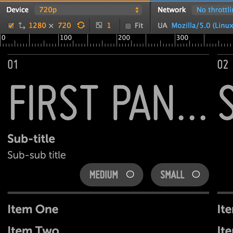
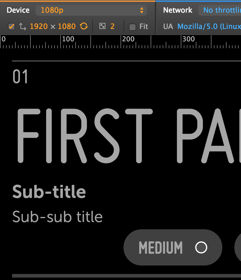
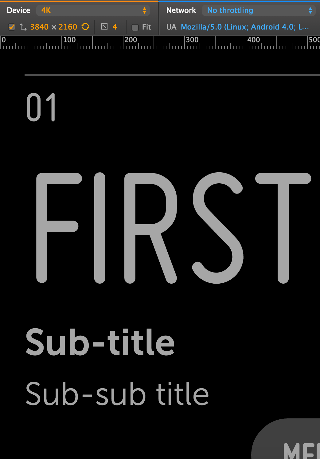
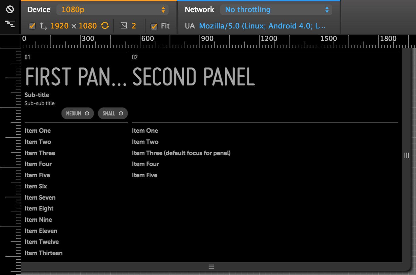
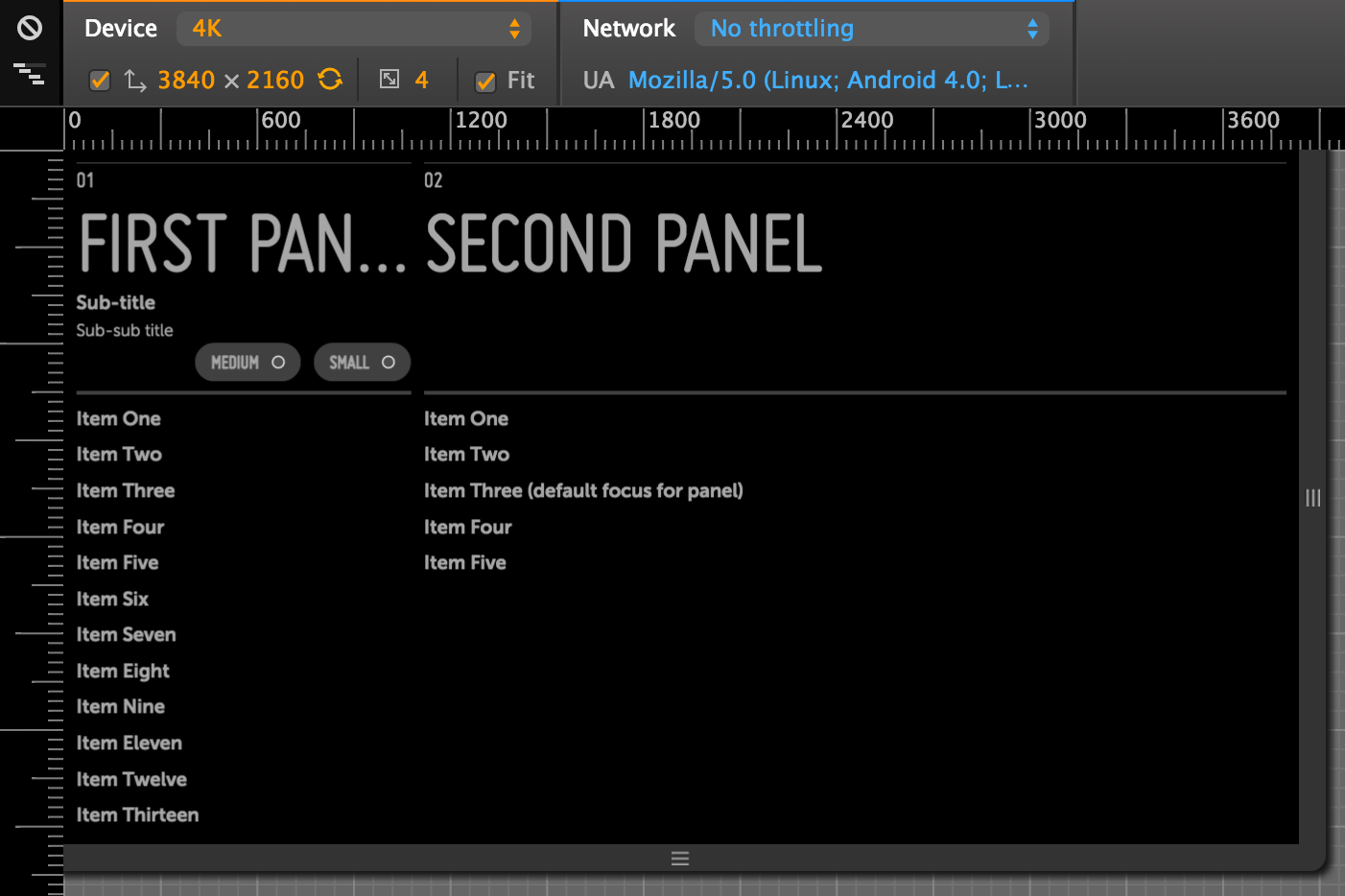
Here's the Moonstone Activity Panels Sample as it appears in the Chrome Web Inspector at various resolutions, with the "Fit" checkbox disabled (click an image to enlarge):
|
|
|
| 720p/HD | 1080p/FHD | 4K/UHD |
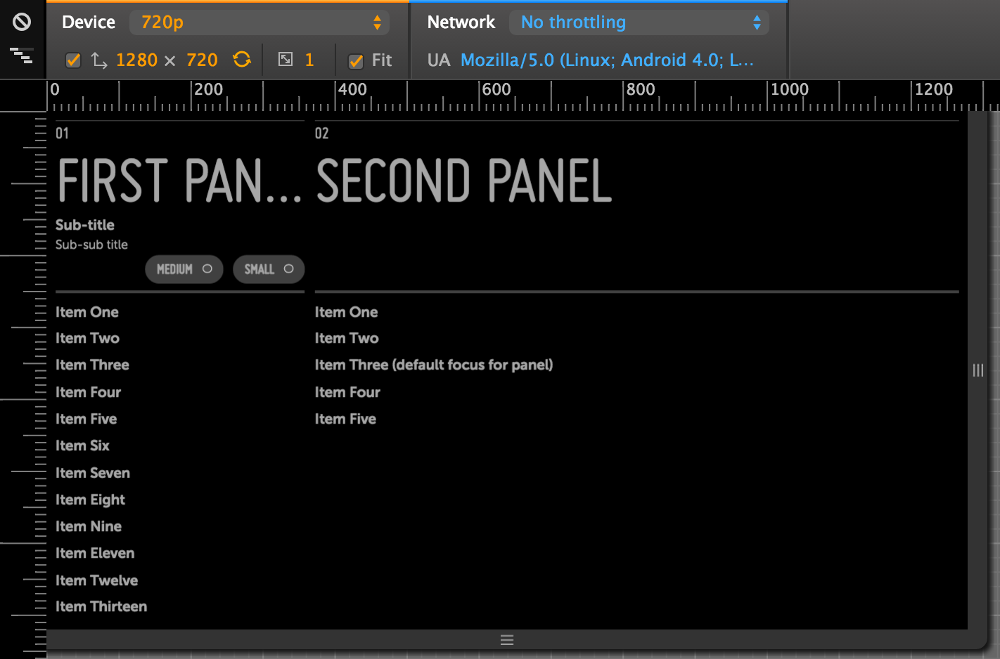
Now, here's the same sample, with the "Fit" checkbox enabled. Notice the measurement lines across the top of each image.
|
|
|
| 720p/HD | 1080p/FHD | 4K/UHD |
Writing resolution-independent CSS
You can continue to use FHD-based pixel measurements when writing the CSS rules in your app's .less and .css files.
Behind the scenes, the framework will automatically convert your FHD-specific measurements to resolution-independent units. You don't need to know the implementation details to use this feature, but if you're curious, you can read the section titled "How resolution-independence works" below.
In very rare circumstances--if you're using CSS background images, for example--you may need to write a few resolution-specific CSS rules. See "Writing resolution-specific CSS" for details.
Writing resolution-independent JavaScript
Ideally, your JavaScript files won't be doing a lot of layout; you should rely on built-in framework features and LESS/CSS rules for layout wherever possible.
However, for cases where you do need to do layout in your JavaScript code, we've added a new function to make that layout code resolution-independent.
ri.scale()
The ri.scale() function (found, like the rest of the ri namespace, in the enyo/resolution module) lets you convert FHD-based pixel values in your JavaScript code to resolution-independent equivalents.
You should use this function to wrap most of the hard-coded pixel values in your app code. For example:
    var
        ri = require('enyo/resolution');

    var buttonWidth = ri.scale(60) + 'px';

    this.$.button.applyStyle('width', buttonWidth);

    // On a 1080p FHD screen:
    // buttonWidth == '60px'
    // On a 720p HD screen:
    // buttonWidth == '40px'
    // On a 4K UHD screen:
    // buttonWidth == '120px'
Note, however, that you should not apply ri.scale() to values that you dynamically measure at runtime, since these values will already be correct for the target resolution.
In the following example, we combine a hard-coded value (with ri.scale() applied) with a dynamically measured value:
    var
        ri = require('enyo/resolution');

    var originalWidth = this.$.button.getBounds().width;

    // The calculation below will add the equivalent of
    // 60 FHD-based pixels to the button's original width
    var newWidth = originalWidth + ri.scale(60) + 'px'

    this.$.button.applyStyle('width', newWidth);
Specifying image assets at multiple resolutions
Both enyo/Image and moonstone/Image now support the declaration of assets at multiple resolutions in the src property.
    var
        kind = require('enyo/kind'),
        Image = require('enyo/Image');

    // Multi-res `src`
    {kind: Image, src: {
        'hd': 'http://lorempixel.com/64/64/city/1/',
        'fhd': 'http://lorempixel.com/128/128/city/1/',
        'uhd': 'http://lorempixel.com/256/256/city/1/'
    }, alt: 'Multi-res'},

    // Standard string `src`
    {kind: Image, src: 'http://lorempixel.com/128/128/city/1/', alt: 'Large'}
As shown in this example, you may populate src with a hash specifying paths to assets at different resolutions; the framework will then select the image to use based on the current display resolution.
For the keys of the hash, use the resolution identifiers seen above--i.e., 'hd' for 720p, 'fhd' for 1080p, and 'uhd' for 4K. If you don't have an image for one of the sizes, the best available image will be chosen automatically.
If you use the height and width properties to specify dimensions for your image, those will be automatically scaled, as well.
Writing resolution-specific CSS
In general, you should not need to write resolution-specific CSS rules. If you think you need to, there's a good chance that something is wrong.
One exception to this rule is if you are using CSS background images. For this and similar cases, we have provided a simple way to write resolution-specific selectors. The framework now applies a class to the document's <body> element to represent the resolution at which your app is currently running: enyo-res-hd for 720p HD, enyo-res-fhd for 1080p FHD, and enyo-res-uhd for 4k UHD.
Here's how to use these classes to write resolution-specific selectors:
    /* Base rule, defaults to FHD */
    .my-view {
        background-image: url('http://lorempixel.com/128/128/city/1/');
    }

    /* 720p HD-only rule */
    .enyo-res-hd .my-view {
        background-image: url('http://lorempixel.com/64/64/city/1/');
    }

    /* 4k UHD-only rule */
    .enyo-res-uhd .my-view {
        background-image: url('http://lorempixel.com/256/256/city/1/');
    }
Writing resolution-specific JavaScript
If you need your JavaScript code to behave differently for different screen types, you can call the ri.getScreenType() method. This will return one of the screen types as a string: 'hd', 'fhd', or 'uhd'. These strings may be used in if statements or switch statements to execute custom code for a given screen type, as in the following examples:
    var
        ri = require('enyo/resolution');

    if ( ri.getScreenType() == 'uhd' ) {
        columns = 5;
    } else {
        columns = 4;
    }
var
ri = require('enyo/resolution');
switch ( ri.getScreenType() ) {
case 'hd':
columns = 3;
break;
case 'uhd':
columns = 5;
break;
case default:
columns = 4;
}How resolution-independence works
All controls are still designed and built from a 1080p/FHD perspective, but pixel measurements are converted into a new CSS unit called rem, whose size we control. Since all measurements are expressed in terms of rem, when the screen size changes, we can easily scale the elements on the screen by changing the size assigned to the individual rem unit (or, in other words, adjusting the conversion factor between rems and pixels).