Panel Structure
Panels are the core structural element for displaying content and navigating the different views of an Enyo/Moonstone application. Panels have several built-in features (e.g., the header, action bar, body/content area, breadcrumbing, and panel transitions), along with a responsive layout for cross-platform compatibility.
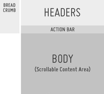
Structure of a Panel
Header
The Header field is used to display the app name and/or panel name.
It may also be turned into a search input field.
The subheaders and sub-subheaders may be used to display additional panel info or contextual action info.
The Header control height may be set to small to allow more room for viewable content below the action bar.
Action Bar
The Action Bar provides a consistent location for actions that may be performed in the context of the current panel or current state of the panel (see Acting on Data.
Common actions include: Filter, Sort, Search, Edit, Move, Delete, Switch View, Share To, Add To, Favorite, Download, Buy, Rent, etc.
By default, all actions are right-aligned.
When a selected action enables a mode such as multi-select or edit, all actions in the action bar may be replaced with confirmation actions, such as OK/Cancel. (See Multi-Select Mode and Edit Mode.)
Body
The body of the panel may be used for navigation, content categories, content details, or whatever else your app would like to present (see Navigation, Displaying Data, Acting on Data, and User Input).
Scrolling content in the body may optionally collapse the header to the smaller state to show more content.
Breadcrumbs
Breadcrumbing is a mechanism for backward navigation that provides context in terms of which panel the user will see when the breadcrumb is selected (see Navigation).
Opening a new panel will turn the current panel into a breadcrumb.
The breadcrumb is a text-only object with a built-in numbering system.
Hide/Show Panels
When the basement has content loaded into it, a hide/show panels indicator will appear on the right side of the screen.
If the user clicks the "hide panels" indicator, all panels and breadcrumbs will transition off screen to the right.
If, while viewing the full screen basement content, the user clicks on the "show panels" indicator, the panels will transition back in from the right; the last panel that the user was in will be open.
Related Topics
Patterns: Navigation, Displaying Data, Acting on Data